Check Release Health Metrics
The Releases view includes four charts that help you monitor the health of each release over time. Each chart displays a separate line for each selected release, making it easier to compare release stability during and after a launch.
The charts use the Error type, time frame, and filters selected in the Releases view. The chart titles also reflect the attribute selected in Compare releases by, such as application.version.
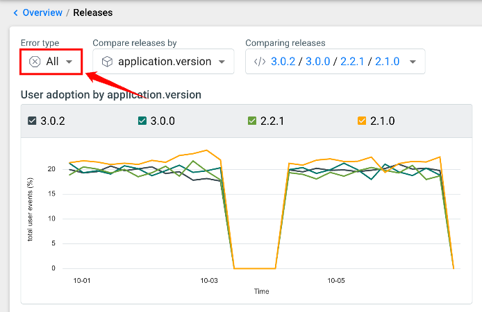
User Adoption
The User adoption chart shows the percentage of total user events associated with each release over time. Use this chart to understand how quickly users move to a new release.
Consider user adoption when reviewing the other health metrics. A release with fewer users may appear more stable because it has less traffic.
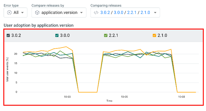
After a release launches, its user adoption should generally increase as users upgrade. Similar adoption levels across releases provide a better basis for comparing their health.
Error-Free Sessions
The Error-free application launches chart shows the percentage of application launches for each release where no errors occurred. A higher percentage indicates a more stable release.
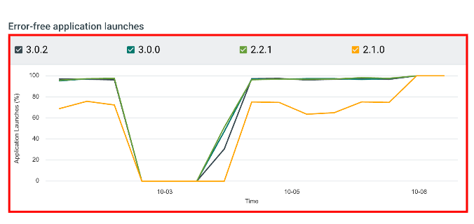
Look for a release whose percentage remains consistently lower than the others. This can indicate that the release is experiencing more errors during application launches.
Errors Over Time
The Errors over time chart shows the number of errors reported for each release over the selected time period. Use it to identify error spikes and monitor how a release performs after launch.
Hover over the chart to view the error count for each release at a specific point in time.
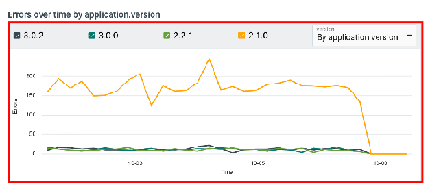
Look for releases with significantly higher error counts than other releases with similar user adoption. Sharp increases or spikes may indicate a stability issue that requires investigation.
New Errors Over Time
The New Errors over time chart shows the number of errors that have not been seen previously, grouped by release. Use this chart to identify errors that may have been introduced by a new release rather than existing errors or previously known issues.
Hover over the chart to view the new error count for each release at a specific point in time.
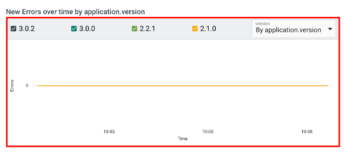
A rise above zero shortly after a release is launched can indicate a potential regression. Investigate these new errors to determine whether they are related to the release.
When every chart drops to zero for all releases at the same time, it usually reflects a gap in incoming data rather than a real change in stability.